MANIFOLD is a Green architecture company who builds homes and commercial buildings using up to 80% less energy. They were looking for a logo that represented their core beliefs, but was relatable to their prospective clients. This required multiple interviews with MANIFOLD and research into permaculture, Voronoi Diagrams and architecture. The process is listed visually below:
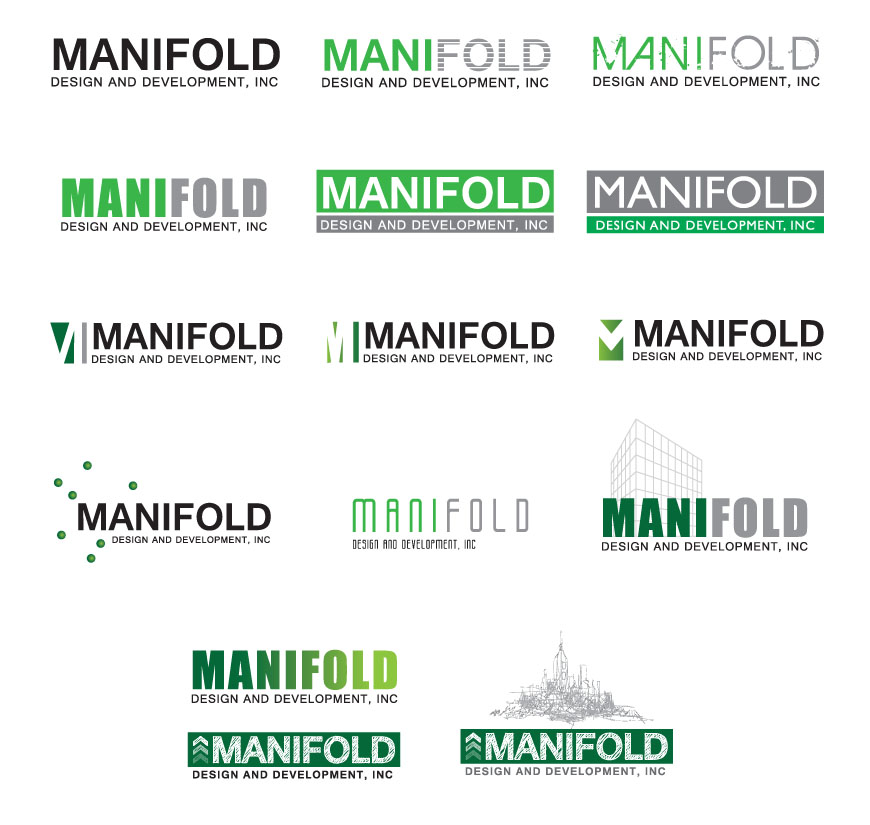
The client was interested in a logo that stated the name but represented a green architecture company.
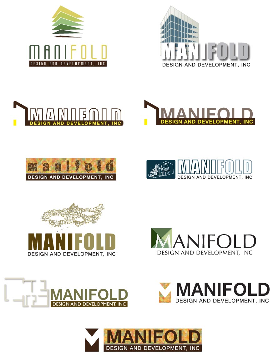
The client liked the use of the name a graphic in the logo, but still wanted the logo to be more warm, mutli-layered and represent permaculture (take care of earth, redistribute surplus) in it’s approach.
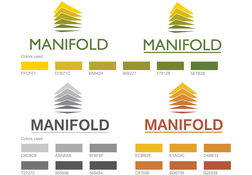
The client wanted further investigation into various color schemes.