When working with Layouts, I begin with a sketch, to get a direction. Then, just like putting a puzzle together, I take all of my pieces and construct my layout, using solid design principals. Below are a few examples:

Full-color Ad for The Castle Pines Connection. The client wanted elegance with soft colors.

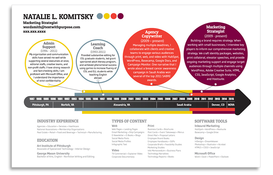
Curriculum Vitae for Natalie Komitsky. Natalie wanted the timeline to reflect her career and the bright colors to reflect her personality.

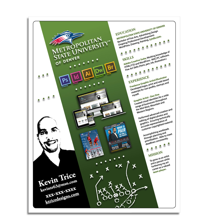
Curriculum Vitae for Kevin Trice. If you look closely, the pictures coincide with the text to the right of it.